The goal was to modernize and unify the navigation system, reducing cognitive load and addressing the needs of distinct user segments: Logged Out, Freemium, and Premium. By aligning with modern web standards and accessibility requirements, we improved usability, optimized mobile experiences, and increased engagement with core tools.
Problem Statement
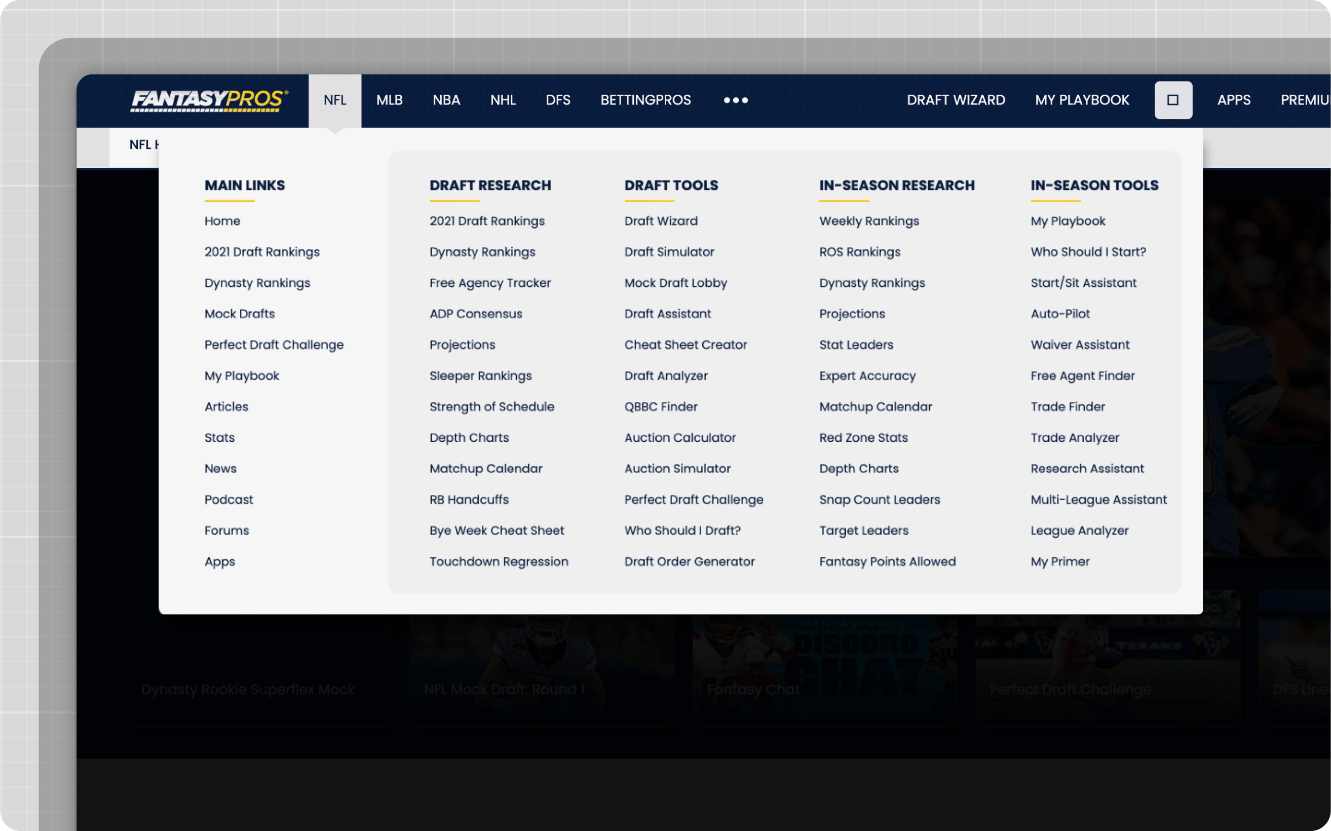
The legacy navigation system faced several challenges:
Cognitive Overload: Users were overwhelmed by duplicated items, inconsistent menus, and poor discoverability.
Fragmented Visual Hierarchy: Multiple disjointed menus with equal prominence created confusion.
Inconsistent Patterns: Navigational elements and interactions varied across the site.
Clutter and Complexity: Overloaded navigation with too many items led to user drop-offs.
Poor Information Hierarchy: High-value content wasn’t prioritized effectively.
Accessibility Barriers: Hover-reliant interactions excluded users with specific needs.
Weak Discoverability: Key tools and features were difficult to locate in the navigation clutter.
Mobile Deficiency: Mobile navigation lagged behind the desktop experience in usability and performance.
Consolidated three menus into one unified structure.
Reduced the number of items by removing duplicates and low-value links.
Created clear navigation levels: Product → Sport → Category → Results.
Improving Visual Hierarchy
Problem: Main items, categories, and subcategories were visually undifferentiated, causing confusion.
Solution:
Established a three-column layout for clarity: Product, Sport, and Category.
Used distinct visual cues (size, color, and spacing) to differentiate main items from secondary elements.
Ensuring Consistency
Problem: Navigation patterns varied across sports and sections, leading to unpredictability.
Solution:
Implemented consistent navigation patterns across all pages.
Developed a single global navigation bar that remained uniform regardless of the sport or page.
Before
After
Optimizing Mobile Navigation
Problem: Mobile navigation usability issues were exacerbated by limited screen real estate.
Solution:
Simplified the mobile interface with streamlined menus.
Applied responsive design principles to ensure consistent usability across devices.
Before
After
Streamlining Complexity and User Journeys
Problem: Cluttered menus with too many items confused users and top priority user journeys weren't prioritized.
Solution:
Organized content into manageable categories and subcategories.
Removed low-traffic links and prioritized high-value features.
Removing content allowed for more navigation space to promote primary actions depending on user state (register, upgrade).
Reorganizing Information Hierarchy
Problem: Misaligned priorities meant low-traffic pages took up prime real estate.
Solution:
Prioritized high-traffic areas like NFL content.
Adjusted hierarchy to highlight product pillars prominently.
Enhancing Accessibility
Problem: Hover-dependent interactions and insufficient keyboard navigation hindered usability for many users.
Solution:
Switched from hover interactions to click-to-open menus.
Improved screen reader compatibility and ensured robust keyboard navigation.
Improving Discoverability
Problem: Overwhelming link volume made key features difficult to locate.
Solution:
Reduced the number of top-level links.
Introduced nesting to group related items logically.
Enhanced search functionality and emphasized high-value tools.
Approach
Research & Discovery:
Conducted user interviews, surveys, and journey analysis.
Benchmarked navigation systems from competitors.
Pulled sitemaps and analytics to identify high-traffic areas and inconsistencies.
Design & Prototyping:
Created wireframes and prototypes, emphasizing usability and accessibility.
Simplified navigation by implementing a logical hierarchy and eliminating redundancies.
Development & Testing:
Partnered with engineering to develop a dynamic backend tool for easy updates.
Ran A/B tests to validate improvements in engagement and conversion.
Feedback Loop:
Monitored post-launch feedback and analytics to iteratively refine the system.
Results
Engagement Gains: Page views to core tools increased by 15%.
Conversion Growth: Registrations grew by 15%, and activations rose by 20%.
Accessibility Compliance: Achieved WCAG 2.1 compliance, improving usability for all users.
Positive Sentiment: The vast majority of surveyed users reported neutral or positive experiences with the new navigation.
Key Learnings
Data-Driven Design: Continuous feedback and analytics were vital for iterative improvements.
User-Centric Focus: Tailoring navigation to user segments enhanced satisfaction and engagement.
Accessibility is Essential: Inclusive design benefits all users, not just those with specific needs.
Consistency Drives Clarity: A predictable, uniform navigation system significantly improves usability.
This comprehensive overhaul delivered a modern, user-friendly, and accessible navigation experience that better serves user needs while aligning with business objectives.


.png)
.png)

.png)
.png)

.png)
.png)

.png)
.png)

.png)